The Primary Front Labels
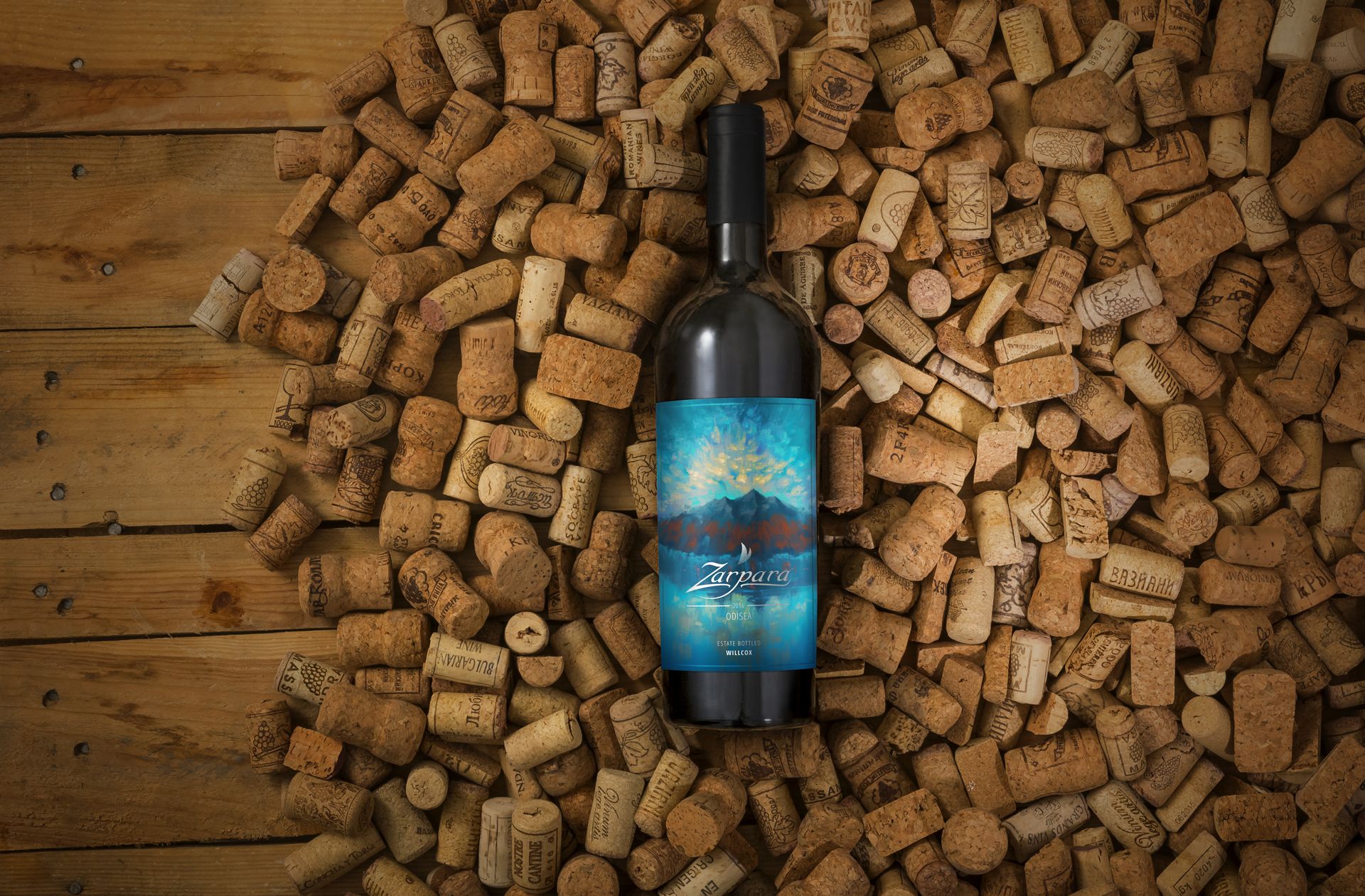
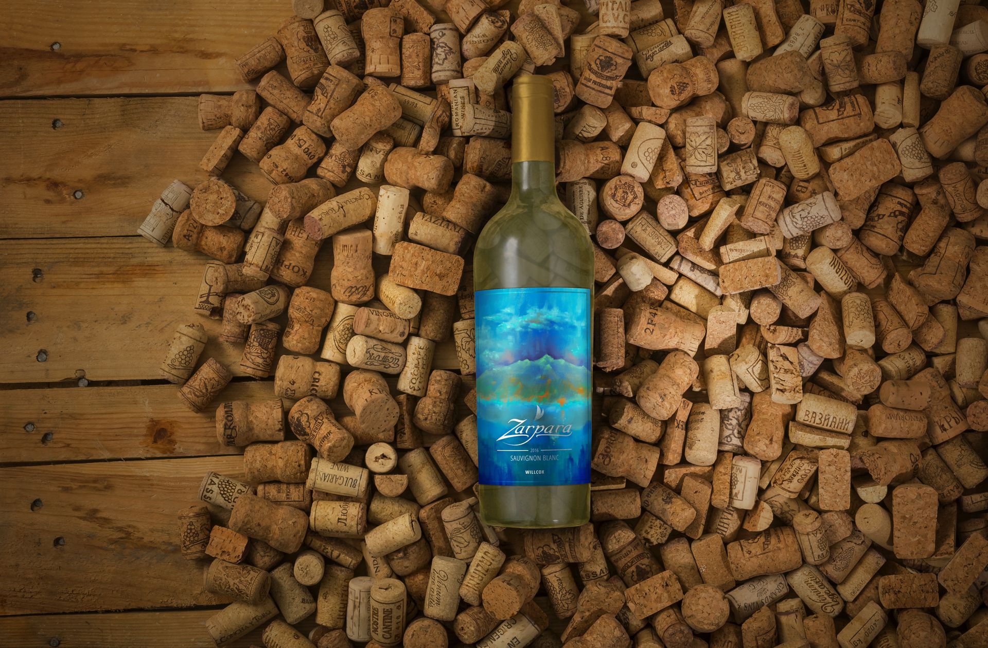
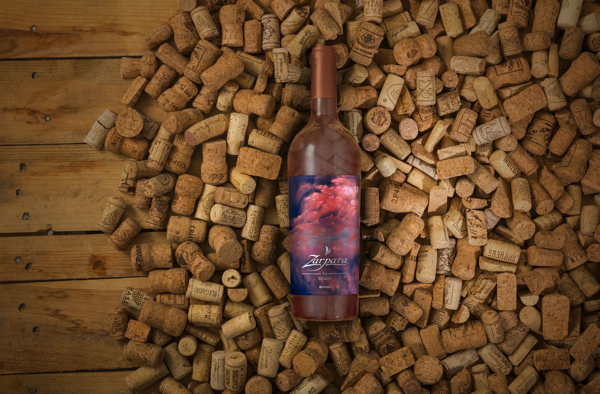
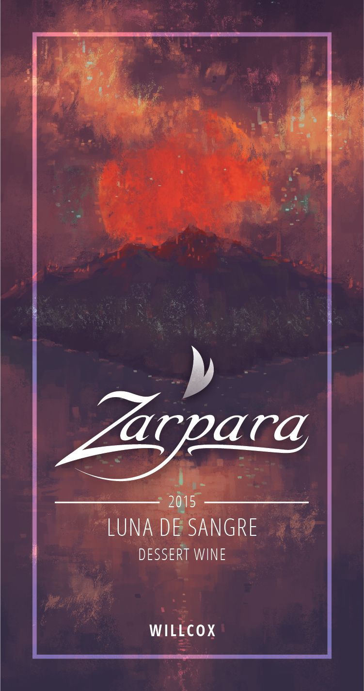
Each label had to seem part of a set while also illustrating the unique qualities and flavors of the wine color they represented.
I began with the white label's illustration, whose look and feel would inform the others. I decided on an impressionistic style of loose brushstrokes and a flat value scale, which gave the label a distinct color palette without competing with the typography.
After the white label's illustration style was established, I moved on to paint the backgrounds for the red and rosé labels. For the red I chose hues evocative of a cloudy dawn, and for the rosé a stormy but pleasant pink-and-purple palette.
